Guiding Question: How does the design and use of visual elements on the magazine cover communicate the themes and target audience of the publication?
Sample Response
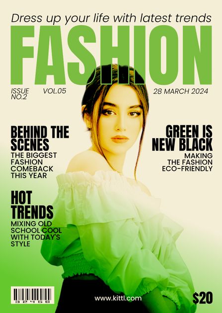
The cover of FASHION magazine is a vibrant and compelling representation of its content and audience. Through a meticulous design that incorporates bold typography, strategic imagery, and cohesive color schemes, the magazine communicates themes of modernity, exclusivity, and sustainability. Each element on the cover is carefully chosen to appeal to a fashion-forward and environmentally conscious readership.
The title “FASHION” is prominently displayed in bold, uppercase letters, with a vibrant green color that immediately captures attention. The use of a serif font conveys sophistication and authority, suggesting that the magazine is a leading voice in the fashion industry. The green color symbolizes freshness and innovation, aligning with the eco-friendly trend mentioned on the cover. This combination of boldness and color not only makes the magazine stand out but also appeals to readers who are interested in both style and sustainability.
Strategically placed teasers in the upper left and right corners further draw the reader’s eye. Headlines like “Behind the Scenes” and “Green is New Black” promise exclusive and trendy content. These teasers suggest that the magazine offers insider knowledge and aligns with current movements towards sustainability. By highlighting such themes, the magazine attracts readers who are keen to stay ahead of fashion trends while also being mindful of their environmental impact.
The central photograph of a young woman looking directly at the camera establishes a personal connection with the audience. This high-contrast image, with its soft lighting, makes the model the focal point, symbolizing approachability and warmth. The choice of a relatable and aspirational figure appeals to readers who aspire to emulate the model’s style and look. The photograph, combined with the green attire of the model, reinforces the theme of eco-friendliness, making the magazine visually and thematically cohesive.
Symbols and colors play a significant role in communicating the magazine’s themes. The recurring green color in the title and the model’s outfit underscores the theme of sustainability. Green, often associated with nature and growth, reinforces the message of eco-conscious fashion. This consistent use of color appeals to readers who prioritize environmental responsibility in their lifestyle choices.
The warm lighting and high contrast between the model’s outfit and the background create an inviting and modern aesthetic. The magazine’s design choices reflect its commitment to staying current and relevant, appealing to readers who are interested in contemporary fashion. The overall visual elements suggest a publication that is not only trendy but also conscientious about global issues.
In conclusion, the FASHION magazine cover effectively uses design and visual elements to communicate its themes and target audience. The bold typography, strategic use of teasers, compelling central image, and cohesive color scheme all work together to attract a readership that values both fashion and sustainability. The cover exudes modernity, sophistication, and a commitment to eco-friendly practices, making it highly appealing to contemporary, fashion-forward readers.
How Did I Prepare?
Understanding the Task: I began by thoroughly understanding the task requirements. The guiding question, “How does the design and use of visual elements on the magazine cover communicate the themes and target audience of the publication?” set the foundation for my analysis. This question directed me to focus on the interplay between visual elements and thematic communication, ensuring that my analysis remained aligned with the objectives of the task.
Analyzing Key Features: I referred to the provided list of key features and examples from text 1.12 to identify the essential elements to be discussed in the magazine cover analysis. These key features included the title, ears and teasers, headlines and captions, photographs, symbols, and the use of lighting and color. Understanding these elements helped me to structure my analysis comprehensively.
Examination of the Magazine Cover: With the key features in mind, I closely examined the uploaded magazine cover of FASHION. I scrutinized each element on the cover, noting how they contributed to the overall message and appeal. This involved analyzing the title’s font, color, and placement, the strategic use of teasers, the central photograph, and the color scheme.
Title Analysis: I considered the significance of the title “FASHION,” noting its bold, uppercase letters and vibrant green color. I reflected on how the choice of font and color communicates the magazine’s authority and modernity, appealing to a fashion-forward audience. The green color’s association with freshness and innovation was particularly noted, aligning with the magazine’s eco-friendly theme.
Ears and Teasers Analysis: I examined the placement and content of the teasers in the upper corners of the cover. By analyzing phrases like “Behind the Scenes” and “Green is New Black,” I identified how these teasers promise exclusive and trendy content, appealing to readers interested in insider knowledge and sustainability.
Headlines and Captions Analysis: I looked at the main headlines, considering their wording and placement. Headlines such as “Behind the Scenes: The Biggest Fashion Comeback This Year” and “Green is New Black: Making the Fashion Eco-Friendly” were analyzed for their ability to intrigue and inform the reader, thus enhancing the magazine’s appeal.
Photograph Analysis: The central photograph of a young woman was analyzed in terms of its visual impact and connection with the audience. I considered the soft lighting, high contrast, and the model’s direct gaze, noting how these elements create a sense of approachability and warmth, making the cover appealing and relatable.
Symbols and Color Analysis: I examined the use of green in both the title and the model’s attire, recognizing its symbolic association with nature and sustainability. This consistent use of color reinforces the magazine’s eco-friendly theme and appeals to environmentally conscious readers.
Lighting and Color Analysis: I assessed the overall lighting and color scheme of the cover, noting how warm lighting and high contrast create an inviting and modern aesthetic. This design choice reflects the magazine’s commitment to contemporary fashion, appealing to readers interested in the latest trends.
Writing the Analysis: With a clear understanding of how each visual element contributed to the magazine’s themes and target audience, I structured my analysis into cohesive paragraphs. Each paragraph focused on a specific element, discussing its design and contribution to the overall message.
Conclusion: I summarized the findings, reiterating how the magazine cover effectively uses design and visual elements to communicate its themes of modernity, exclusivity, and sustainability. I highlighted the cover’s appeal to a fashion-forward and environmentally conscious audience.
By following these steps meticulously, I ensured that my analysis was comprehensive, detailed, and aligned with the guiding question. This preparation process helped me to produce a thorough and insightful analysis of the FASHION magazine cover.
Get in touch with us to prepare for English examinations of any kind. We teach OET, IELTS, PTE, IB and CBSE. We use simple tricks to learn and memorize complex structures for Reading, Listening, Writing and Speaking. Our Personal Trainers are quite down to the earth and well experienced.


GIPHY App Key not set. Please check settings