
Blog
IBDP Infographic
“How effectively does the infographic ’15 Methods to Master Your Time’ use visual and textual elements to convey practical time management techniques to its target audience?”
Sample Analysis
Below is a sample analysis of the sample infographic above. We follow the Intro-BPs-Closing Structure that follows Introduction, Body Paragraphs and Closing Paragraph. First, read the entire analysis:
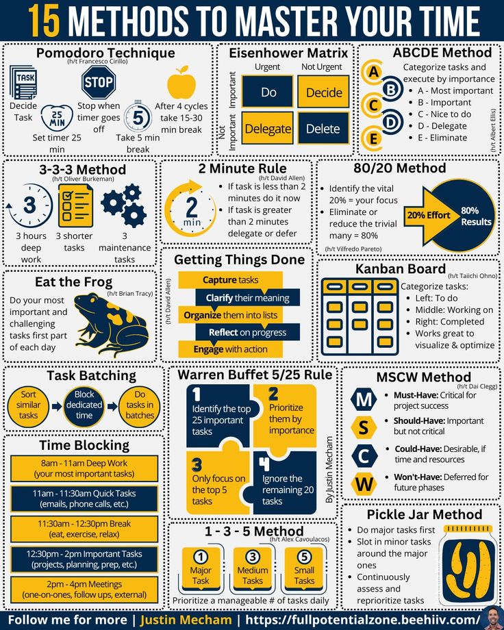
The infographic titled “15 Methods to Master Your Time” serves as an engaging and visually compelling guide aimed at helping readers improve their time management skills. In an era where efficiency and productivity are paramount, this infographic presents practical, actionable techniques to enhance one’s ability to manage time effectively. By combining various design elements such as images, colors, and layout, the infographic not only captures attention but also ensures that the information is easily digestible. This analysis will delve into how these elements work together to create an informative and persuasive piece, highlighting its strengths and areas for improvement to ensure a comprehensive understanding of its effectiveness.
Looking at the textual and visual elements, the infographic is rich with all that make it info and graphic. The images used in the infographic play a crucial role in enhancing the visual appeal and aiding comprehension. Each method is accompanied by an icon or visual element that represents the technique, making it easier for readers to quickly grasp the concept. For instance, the Pomodoro Technique is represented by a timer icon, which reinforces the idea of working in short, focused intervals. Similarly, the Eisenhower Matrix is visually represented by a quadrant chart, illustrating the categorization of tasks based on urgency and importance. The use of visuals not only makes the infographic more engaging but also helps in retaining information by providing a quick reference to the techniques. The colors chosen for the infographic are calming tones of blue, green, and white, which are associated with productivity and focus. This cohesive color scheme creates a harmonious and visually appealing design, while also ensuring that the text is easily readable against the background. The contrast between the text and background colors is well-balanced, making the content clear and legible. For example, the green background of the “2 Minute Rule” section contrasts well with the white text, enhancing readability.
The layout of the infographic is well-organized, with a clear and logical structure that guides the reader through the content. The use of headings, subheadings, and bullet points creates a visual hierarchy, making it easy to navigate. The infographic is divided into sections, each focusing on a different time management technique, which prevents overcrowding and ensures that the information is presented in manageable chunks. The font choices are clear and legible, with varying sizes to create a visual hierarchy. Titles and headings are bold and larger, drawing attention, while descriptions are smaller but still readable. The use of bold for the main titles such as “Pomodoro Technique” and “Eisenhower Matrix” makes these headings stand out. Italics are used for emphasis in certain sections, such as the key points of each method. The primary purpose of the infographic is to inform readers about effective time management techniques, but it also aims to persuade them to adopt these methods in their daily lives. The professional yet approachable tone of the language used makes the content accessible to a wide audience. The target audience includes individuals looking to improve their productivity, such as students, professionals, and anyone interested in time management.
The slogans and mode of address used in the infographic are direct and imperative, providing clear instructions and encouraging action. For example, the use of imperative sentences like “Set a timer for 25 minutes” and “Tackle the most challenging task first” provides clear and actionable advice. The narrative style is straightforward and practical, ensuring that the reader can easily understand and implement the techniques. The structure of the infographic includes a headline, subheadings, bullet points, and paragraphs, creating a clear and logical flow of information. The overall layout is clean and well-organized, with ample spacing between sections to prevent overcrowding. Rhetorical devices such as metaphors and alliteration are used to enhance the appeal of the content. For instance, the method “Eat the Frog” uses a metaphor to suggest tackling the most challenging task first, making the concept memorable. Emotive language is used to motivate and inspire the reader to take action, while persuasive techniques such as repetition and parallelism reinforce the effectiveness of the methods. An example of repetition is found in the “3-3-3 Method,” where the phrase “three tasks” is repeated to emphasize the simplicity and manageability of breaking tasks into smaller parts. Visual cues, including symbols, color schemes, images, and layout, guide the reader’s eye and enhance comprehension. Typography, including the use of bold for main titles, italics for emphasis, varying text sizes for visual hierarchy, and contrasting text colors, adds emphasis and clarity.
Punctuation is used effectively to enhance readability, with questions and exclamations adding emphasis. For example, the phrase “Why wait? Start now!” uses a question mark and exclamation point to prompt immediate action. The headlines, titles, and captions are clear and informative, guiding the reader through the content. The use of light and shadow is minimal but effective, adding depth and dimension to the visuals. The context of the infographic is primarily educational, focusing on providing practical advice for time management in a contemporary setting. The tone is motivational and friendly, encouraging the reader to take action and improve their productivity.
Repetition, parallelism, and alliteration are used to create a rhythmic flow and enhance the memorability of the content. For instance, the alliteration in “Methods to Master” adds a catchy and memorable element to the title. Ethos, pathos, and logos are employed to establish credibility, appeal to emotions, and present logical arguments. Themes such as productivity, efficiency, and self-improvement are central to the infographic, resonating with the reader’s desire to manage their time effectively. The reader’s perspective is considered, with the content tailored to be easily understandable and actionable. The infographic maintains objectivity by providing practical advice without oversimplifying complex ideas.
One aspect that could improve the infographic is the inclusion of more diverse examples or case studies to illustrate the effectiveness of each method. Providing real-life scenarios where these techniques have been successfully implemented would add depth and make the content more relatable. Additionally, including interactive elements such as QR codes leading to further resources or video explanations could enhance engagement and provide a more comprehensive learning experience.
In conclusion, the infographic “15 Methods to Master Your Time” effectively combines various elements to create an engaging and informative piece of content. The use of images, colors, layout, font choices, and contrast enhances the visual appeal and readability, while the clear structure and logical flow ensure that the information is easily comprehensible. The infographic successfully achieves its purpose of informing and persuading readers to adopt effective time management techniques, making it a valuable resource for individuals seeking to improve their productivity. The detailed analysis highlights the strengths of the infographic in delivering information and capturing the reader’s interest, ensuring its effectiveness as an educational tool. By considering all the mentioned elements and suggesting areas for improvement, the infographic stands out as a well-crafted and effective piece of visual communication.
That’s our first round of assessment. Now, there are 10 areas for improvement in this assessment – 10 aspects most students often overlook. If you wish to know all that is missing in this, join a 1-hour personal session. Contact +919810740061. One of our expert teachers will be happy to spend time with you!
Leave a Reply
You must be logged in to post a comment.